Saturday, September 24, 2016

Visualisation of Indian Cricket Team's Test Match Performance (since 2000)

Often the test matches start on Thursday and end on Monday. As Monday is a working day, a lot of office goers face distraction from work as the last day of Test match is often the most exciting day with lots of action. This scheduling pattern of test matches is also evident in the ongoing India-New Zealand Kanpur Test match as well which began on 22nd September 2016, Thursday. 

Based on these thoughts, I have created a visualisation on the performance of the Indian Cricket Team in Test matched since 2000 and have tried to see if there is an observable pattern of results by last day of a test match.

Here is the link for visualisation:
https://public.tableau.com/profile/n.singh#!/
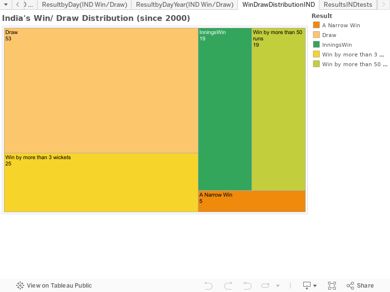


Observation:
Wins and narrow wins have occurred in matches ending on Monday.
I categorised any test win by less than 50 runs or by less than or equal to 3 wickets as a narrow win.

Feedback and comments are highly solicited. If you believe that there is a discrepancy in the visualisation, please also point out the same as well.

Thanks.

References:

Monday, September 5, 2016

Sentiment analysis of e-commerce firms in India: August 2016

Hello readers,

After a break of 2 months, the sentiment analysis series is back.
I hope you all must be doing very good.
Happy Ganesh Puja to my readers!

Table of sentiment analysis scores: [Note that Snapdeal's twitter handle did not respond to our request for tweets]


Sl. No.
Names
Total tweets
Positive tweets
Negative tweet
Sum
score
4
Jabong
8749
754
64
818
92
1
Amazon
6090
944
190
1134
83
2
eBay
1368
111
56
167
66
5
Myntra
1045
64
71
135
47
3
Flipkart
6986
383
723
1106
35

Total tweets: Total number of tweets returned from the official twitter handles
Positive tweets: Number of tweets that are either marked as positive or extremely positive
Negative tweets: Number of tweets that are either marked as negative or extremely negative
Sum: Sum of positive and negative tweets
Score: Positive tweets/ Total tweets

Chart of tweets categorised as positive to negative and the trend chart are as under (trend chart falls to zero for the past two months as I was not ranking the firms and has nothing to do with anything else):

(click to enlarge)


(click to enlarge)


References:
1. twitteR package for R
2. Original twitter handles of the e-commerce firms (Snapdeal's twitter handle did not respond to our request for tweets.)
3. Twitter API
4. R Programming Language


Monday, August 15, 2016

In-flight 720p streaming video plans compared

Update 2: Govt. regulatory body TRAI allows In-flight Cellular services.
Catch more details here:
https://timesofindia.indiatimes.com/india/trai-allows-wifi-and-mobile-services-on-board-for-flyers-in-and-over-india/articleshow/62570754.cms
https://www.ndtv.com/india-news/telecom-regulator-recommends-internet-in-flight-mobile-calls-in-india-1802235 


Update: A very useful collection of traveller's reviews: https://www.sleepinginairports.net


The today's SMH article mentioning that Quantas has decided to offer free in-flight Wi-Fi is a really good news for frequent travellers and road warriors who need to catch up with their weekly dose of entertainment. Be it the live streaming of Olympic games from Rio or watching the latest Game of Thrones episode, in-flight Wi-Fi can be a real time saver.

I decided to create a hypothetical scenario in which all the passengers in an Airbus-A320 Neo decide to watch the video content for the entire duration of flight. A quick google search threw up these numbers:
A full flight can accommodate 195 passengers.
A minute of 720p video consumes 10MB of bandwidth.
An Airbus can fly for 7 hours on a full tank.
So the maximum data that can be consumed by a flight full of passengers in a flight is:
195*7*60*10= 819,000MB or 819GB (a mammoth size)
Dividing it by the number of passengers, we are looking at an average data consumption of 4.2GB per passenger during a flight. (another very unlikely figure)

I searched for plans of the airlines that satisfied my requirement for video streaming and landed up with this article. I used the plans mentioned on the page and extrapolated numbers for some plans as needful and then plotted the points on a scatter plot to see the relative positions of the 12 airlines.

The graph is as under and the presentation is linked here:

Download the linked presentation.
The readers are invited to point out improvements to the approach. Thanks.

Wednesday, July 20, 2016

Strategic petroleum reserves: India

Hello,

Some time back, I had written an article on nature of Strategic Petroleum Reserves.
You can read it here:
STRATEGIC PETROLEUM RESERVES AND ‘UN-FLAT’ NESS OF THE WORLD

Today, I have read another article related to growth of Strategic Petroleum Reserves in India.
Read it here: India responds to growth in oil imports

Currently, a 13 day reserve for India is being planned which is proposed to be increased to 90 days worth. So, which are the countries that are suitably covered by this 13 day storage?

Locations and travelling times for an oil tanker to travel from their port to an Indian Port of Paradip:


Thus, a SPR of 13 days will reduce the Indian dependency on Gulf states but will not cover the oil imports from African and South American countries. Details of port and OPEC annual production data are as under:


An SPR of 90 days will however cover all the oil imports requirements from the 13 places considered. However, we don't have the volumetric import data of India from each of these place which would help in preparing an optimization study.

Thank you.


References:

1. Transit Times and Distance using https://www.searates.com

Monday, July 18, 2016

Comparison of top 10 and bottom 11 Fortune 500 firms

Hello readers,

A text analytics based comparison was done to find unique characteristics of firms belonging in the two clusters:

Cluster 1:
Rank 1: Walmart
Rank 2: Exxon Mobil
Rank 3: Apple
Rank 4: Berkshire Hathaway
Rank 5: McKesson
Rank 6: United Health Group
Rank 7: CVS Health
Rank 8: General Motors
Rank 9: Ford Motor
Rank 10: AT&T

Cluster 2:
Rank 490: Rockwell Collins
Rank 491: Lam Research
Rank 492: Fiserv
Rank 493: Spectra Energy
Rank 494: Navient
Rank 495: Big Lots
Rank 496: Telephone & Data Systems
Rank 497: First American Financial
Rank 498: NVR
Rank 499: Cincinnati Financial
Rank 500: Burlington Stores

Download report:
Detailed report containing observation commentary, correlation plots and word clouds is available for download here: Report


Correlation plot for Ford Motor
R programming language (along with packages "tm", "RGraphviz", "graph" and "slam") was used to prepare this analysis report. Citation for each has been provided below.

Do leave comments below. Thanks.


Citations:
  • R Core Team (2016). R: A language and environment for statistical computing. R Foundation for Statistical Computing, Vienna, Austria. URL https://www.R-project.org/.
  • Kurt Hornik, David Meyer and Christian Buchta (2016). slam: Sparse Lightweight Arrays and Matrices. R package version 0.1-35. https://CRAN.R-project.org/package=slam
  • Kasper Daniel Hansen, Jeff Gentry, Li Long, Robert Gentleman, Seth Falcon, Florian Hahne and Deepayan Sarkar (2016). Rgraphviz: Provides plotting capabilities for R graph objects. R package version 2.16.0.
  • R. Gentleman, Elizabeth Whalen, W. Huber and S. Falcon (2016). graph: graph: A package to handle graph data structures. R package version 1.50.0.
  • Ingo Feinerer and Kurt Hornik (2015). tm: Text Mining Package. R package version 0.6-2. https://CRAN.R-project.org/package=tm 
  • Ingo Feinerer, Kurt Hornik, and David Meyer (2008). Text Mining Infrastructure in R. Journal of Statistical Software 25(5): 1-54. URL: http://www.jstatsoft.org/v25/i05/.
  • Latest annual reports were collected from individual websites of each of the 21 companies analyzed in the report.

Thursday, July 7, 2016

Chilcot Report : Text analytics (Wordcloud and correlation plots)

Hello readers,

The Chilcot Report has been published.
You can read the report here:
http://www.iraqinquiry.org.uk/the-report/

I have taken a shot at it by merging all the 58 PDF files into a merged PDF document.
I then converted it into text and made a wordcloud.
The wordcloud is as under:
More analysis to follow.
Thanks.

UPDATE:

The correlation plot has been prepared. It can be viewed from the following link:
CHILCOT REPORT ANALYSIS

Saturday, June 4, 2016

Sentiment analysis of e-Commerce firms in India: May 2016

The results are as under.
Detailed report available only via solicitation.
Send requests through comments below.


(Twitter Sentiment Score by months)


(Spread of positive and negative tweets for May 2016)

Thank you.

Your Release Just Wrote Its Own Docs

  Every release ships with a shadow task nobody wants: writing the docs. The README needs updating. The changelog needs to actually reflect...